Over 1000 artists and designers got involved in Glowing, the Adobe Challenge to raise awareness of dying corals.
/design
Adobe and Pantone, in collaboration with The Ocean Agency, launched a global campaign using colour and creativity to drive ocean protection and climate action. They challenged designers to create interpretations based on the campaign's brief.
Corals aren’t just turning white and dying, some are displaying vibrant colours in a desperate bid to survive. This phenomenon of coral fluorescence served as the inspiration for the campaign's colour palette, as seen in the Netflix original documentary Chasing Coral. Designers were required to use only coral’s fluorescing colours -three Glowing Colours- with black and white as optional secondary shades, allowing for gradients but no other colours.
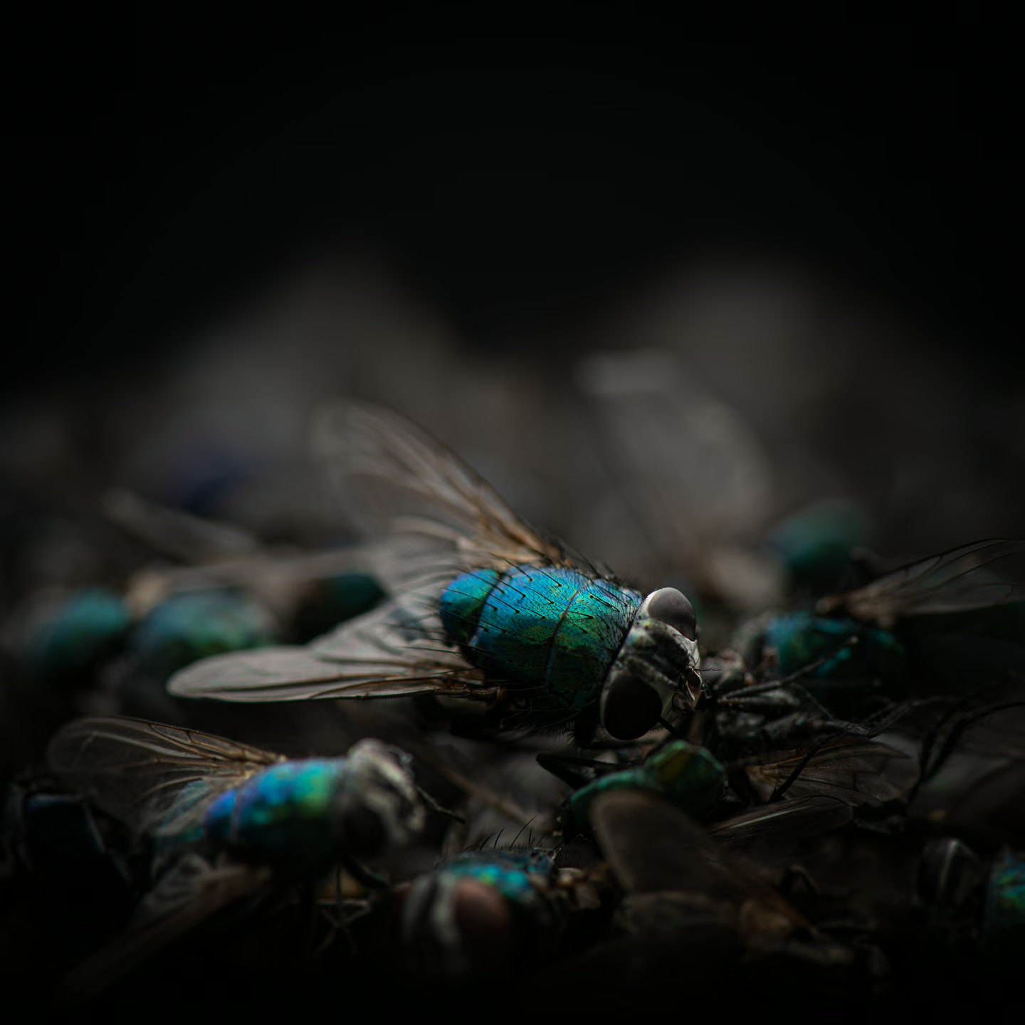
My approach was to bring in a shocking element that would represent the damage that is happening to the coral. This element would have 2 functions. Firstly to represent the death of the coral and secondly, to have the same look.


Family and friends assisted in gathering around 57 dead flies to bring this project to life.
Inspired by the stark reality of dying coral, I chose to use dead flies to recreate the effect, bridging the unsettling connection from flies to coral.
After multiple photographs, I selected the best results to create a powerful collage. The image was then meticulously edited to remove dust and enhance its mass, followed by colour grading to fit the project’s brief. The final poster unfolds in two visual steps: first, presenting a sense of beauty, then gradually revealing the true nature of what is being viewed.


